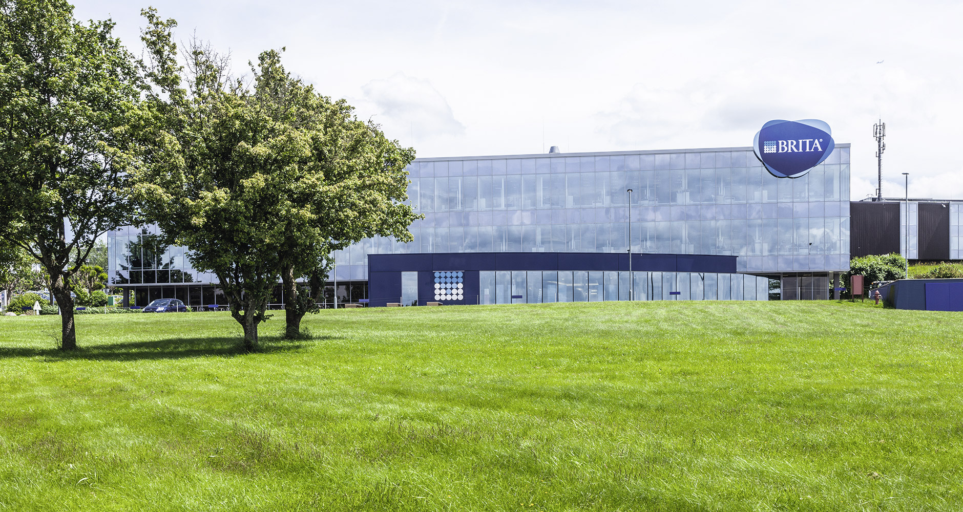
FILTERED, NOT STIRRED – A NEW LOGO FOR BRITA
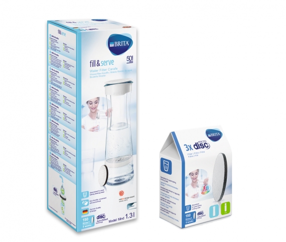
DAS STUDIO is responsible for all of BRITA’s packaging and PoSM needs. From graphic adaptations to artwork for packaging, from product photography to mock-ups and retouching, DAS STUDIO offers all the services BRITA needs in order to succeed at the PoS.
Based on this successful partnership in its day-to-day business, BRITA also entrusted the team at DAS STUDIO with the color development/elaboration of the new BRITA logo. In addition, it created a color management folder with corresponding materials for the relaunch of the Corporate Design.
From 4C to 2C
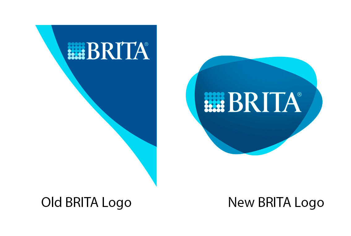
The Hotcake agency developed the new BRITA Liquid logo and delivered three different versions in 4c. The task for DAS STUDIO was to realize this new logo in 2c, using just one special color plus cyan. In addition, they were asked to retain the logo’s “freshness and lightness.” That meant they needed to find a new shade of blue that could also act as BRITA’s new corporate color when used by itself.
The DAS STUDIO specialists submitted more than 40 color versions, gradually honing in on the final shade that was used in the end. In the process, they made various test prints of the logo on print test forms, working closely with the print studio. After the final Liquid logo was created (2c), they created the color variants for CMYK, sRGB and gray; in addition, the “BRITA_word_image_mark” was created in all of the different color versions.
For daily use, the customer wanted clear operating instructions and practical guidelines. The development process mainly focused on the color reference for the most common means of communication, in other words for reproducing the various logo versions and the corporate colors. The color cards are the most important part of the “Color Matching Toolkit,” since they are used as a physical reference document.
Color cards in a handy accordion folder
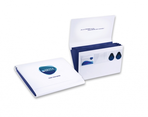
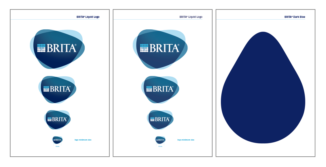
The DAS STUDIO team worked with Werner Achilles GmbH & Co KG, Celle, to create the necessary folder. They designed it as a convenient accordion folder with five compartments and four adhesive pockets. The design was intentionally kept simple in order to emphasize the clarity of the logo and the contents of the folder. In addition, the accordion folder can be taken anywhere, and the contents can always be expanded. Three color cards were created as color references for the new Liquid logo and the new shade of BRITA blue. The cards show the logo in various sizes and also display the logo on the front right side, cut in half, so that it can be held up to the printed samples, etc., for easier color comparison.
For the “design” of the single BRITA color, DAS STUDIO worked with the customer to develop a droplet shape that would evoke the theme of water / liquid. In addition, the three cards printed by the Karl Knauer print studio each feature a brief text about proper use as well as the material, manufacturer and color information.
The following three cards were created:
1 Liquid logo on / for coated paper
1 Liquid logo on / for uncoated paper and business paper
1 new BRITA color on coated paper
In order to ensure a uniform appearance for the new logo, BRITA also requested a detailed CD guide and a short “Logo Quickguide.”
Both were designed by the Schitto Schmodde Werbung agency in Frankfurt. DAS STUDIO produced the Logo Quickguide and included it in the accordion folder.
CD-Guide in credit-card format
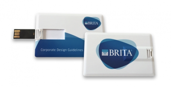
The detailed BRITA CD guide was only designed to be available in “online/digital” format, and to be included in the accordion folder on a USB flash drive.
DAS STUDIO then decided to work with the customer to create a USB flash drive in credit-card format.
The color of the logo and the reverse side of the USB drive were adapted to the 4c color values as much as possible. The credit-card-format USB flash drive was then included in one of the adhesive pockets in the accordion folder. In addition, BRITA created two single-color plastic color samples with a droplet shape, which are also included in two adhesive pockets in the folder.
The overall process, from initial idea to final printing, took three months.
The accordion folder was assembled at BRITA’s facilities in Taunusstein.
“Our strategic new BRITA brand positioning creates the basis for our brand image: dynamic, modern, unique and self-assured. The new logo and the Corporate Design provide the right framework. Supported by our strong brand values, this will allow us to fulfill our brand promises to our customers, partners and consumers. And our current worldwide campaign “THINK YOUR WATER” invites people to rethink their drinking habits and to discover the “smart” new BRITA product portfolio.” Ulrich Bergweiler, Director of Brand Marketing, BRITA.
FILTERED, NOT STIRRED – A NEW LOGO FOR BRITA
CREATIVE PRINT PACKAGING
DAS STUDIO is responsible for all of BRITA’s packaging and PoSM needs. From graphic adaptations to artwork for packaging, from product photography to mock-ups and retouching, DAS STUDIO offers all the services BRITA needs in order to succeed at the PoS.
Based on this successful partnership in its day-to-day business, BRITA also entrusted the team at DAS STUDIO with the color development/elaboration of the new BRITA logo. In addition, it created a color management folder with corresponding materials for the relaunch of the Corporate Design.


From 4C to 2C
The Hotcake agency developed the new BRITA Liquid logo and delivered three different versions in 4c. The task for DAS STUDIO was to realize this new logo in 2c, using just one special color plus cyan. In addition, they were asked to retain the logo’s “freshness and lightness.” That meant they needed to find a new shade of blue that could also act as BRITA’s new corporate color when used by itself.
The DAS STUDIO specialists submitted more than 40 color versions, gradually honing in on the final shade that was used in the end. In the process, they made various test prints of the logo on print test forms, working closely with the print studio. After the final Liquid logo was created (2c), they created the color variants for CMYK, sRGB and gray; in addition, the “BRITA_word_image_mark” was created in all of the different color versions.
For daily use, the customer wanted clear operating instructions and practical guidelines. The development process mainly focused on the color reference for the most common means of communication, in other words for reproducing the various logo versions and the corporate colors. The color cards are the most important part of the “Color Matching Toolkit,” since they are used as a physical reference document.
Color cards in a handy accordion folder
The DAS STUDIO team worked with Werner Achilles GmbH & Co KG, Celle, to create the necessary folder. They designed it as a convenient accordion folder with five compartments and four adhesive pockets. The design was intentionally kept simple in order to emphasize the clarity of the logo and the contents of the folder. In addition, the accordion folder can be taken anywhere, and the contents can always be expanded. Three color cards were created as color references for the new Liquid logo and the new shade of BRITA blue. The cards show the logo in various sizes and also display the logo on the front right side, cut in half, so that it can be held up to the printed samples, etc., for easier color comparison.
For the “design” of the single BRITA color, DAS STUDIO worked with the customer to develop a droplet shape that would evoke the theme of water / liquid. In addition, the three cards printed by the Karl Knauer print studio each feature a brief text about proper use as well as the material, manufacturer and color information.
The following three cards were created:
1 Liquid logo on / for coated paper
1 Liquid logo on / for uncoated paper and business paper
1 new BRITA color on coated paper
In order to ensure a uniform appearance for the new logo, BRITA also requested a detailed CD guide and a short “Logo Quickguide.”
Both were designed by the Schitto Schmodde Werbung agency in Frankfurt. DAS STUDIO produced the Logo Quickguide and included it in the accordion folder.


CD-Guide in credit-card format
The detailed BRITA CD guide was only designed to be available in “online/digital” format, and to be included in the accordion folder on a USB flash drive.
DAS STUDIO then decided to work with the customer to create a USB flash drive in credit-card format.
The color of the logo and the reverse side of the USB drive were adapted to the 4c color values as much as possible. The credit-card-format USB flash drive was then included in one of the adhesive pockets in the accordion folder. In addition, BRITA created two single-color plastic color samples with a droplet shape, which are also included in two adhesive pockets in the folder.
The overall process, from initial idea to final printing, took three months.
The accordion folder was assembled at BRITA’s facilities in Taunusstein.
“Our strategic new BRITA brand positioning creates the basis for our brand image: dynamic, modern, unique and self-assured. The new logo and the Corporate Design provide the right framework. Supported by our strong brand values, this will allow us to fulfill our brand promises to our customers, partners and consumers. And our current worldwide campaign “THINK YOUR WATER” invites people to rethink their drinking habits and to discover the “smart” new BRITA product portfolio.” Ulrich Bergweiler, Director of Brand Marketing, BRITA.
If you have any questions about packaging or about BRITA in general, Björn Hegner will be happy to help: b-hegner@das-studio.de
